Creating an infectious brand
Issue: Real superheroes
25 February 2014 article

During 2012 the Society revised both its Vision and Mission statements and put in place a Strategic Plan that reflects the major priorities the Society will be addressing over the next 5 years. Everything the Society does is inspired by its Mission and Vision priorities and is based on our collective passion for microbiology within the Society.
This period of reflection and development provided the Society with an excellent window of opportunity to assess the Society’s current brand to ensure it still aligned with the values of the Society. A branding working group, Chaired by Council member Paul Hoskisson, was set up to both lead on and oversee the rebranding process and make recommendations to Council. The other members of the group were three early career microbiologists, Sarah Maddocks, James Redfern and Lorena Fernandez-Martinez.
So what does the word ‘brand’ mean?
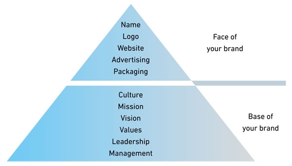
A brand is like your personality – it is the core of who you are. A brand is much more than a visual identity; it is the name, logo and graphic design used by an organisation. It is what people believe you stand for – your tone and your voice. Branding is the process of building a positive collection of associations and perceptions in your stakeholder’s minds. Our organisation’s brand sits firmly on a strong base formed by the Society’s mission, vision, values and culture as illustrated in the diagram below.
The branding process
With every brand reinvention the following two fundamental questions need to be answered; firstly, what still works for the brand and should be carried forward; and secondly, how far can you move forward without losing your most loyal members, while ensuring you gain new ones.
Following a member survey it was apparent that there was no appetite from those that responded to change the name of the Society. They felt the current name gave a sense of heritage, longevity and authority and was well known within the community. Therefore, Council agreed that they would protect the name from the rebranding process. However, everything else, including the icon, the word mark, the look and feel and the strapline was put under the spotlight and reviewed.
Brand perception research
The design brand agency Firedog ran a series of four workshops, for both members and Society staff, during the first half of 2013. The aim of the workshops was to explore values, perceptions, ideas and beliefs within the field of microbiology that would inform and inspire the Society’s visual identity. The results from the workshops helped Firedog define the Society’s brand character including the mood and tone the Society wished to reflect.
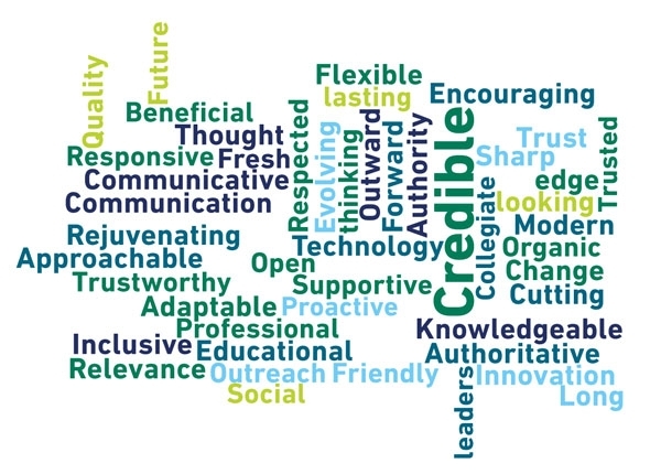
Today’s Microbiology Society – uncovering a brand’s essence
While all the words in the word cloud (above) reflect today’s Microbiology Society, the following six key words were identified to sum up the organisation: professional, modern, forward-thinking, approachable, credible and outward-looking.
The new logo
An instantly recognisable symbol of the Society, the logo is the most valuable asset of our brand. The new logo, which consists of an icon and a word mark, has been designed to communicate the values of our Society. We spell out our name in full: Microbiology Society, as this gives clarity to who we are when engaging with our diverse range of stakeholders.

Brand look and feel
The typeface, Din Next Pro, is both modern and versatile and has been selected to communicate with confidence and authority.
Soft organic shapes, inspired by those found within the logo, are used throughout the identity. The visual style is based around the coming together of research and analytical minds and microbiology as a visual metaphor. The visual style utilises the hard geometric shapes to represent the analytical aspect of the organisation and the softer, more organic ones for the microbiological side.
Launch
To coincide with the Society fully relocating to Charles Darwin House, an internal launch was held in January this year and was followed by an external launch in February; this saw the transition from old to new across all the Society’s digital and traditional platforms.
Paul Hoskisson said, ‘I am delighted with the Society’s new brand; it reflects both our heritage and our desire to keep evolving so we remain relevant both today and in the future. Microbiology is fundamentally important and central to our daily lives – driving virtually all processes on Earth. We have an exciting story to tell and our new visual identity should help us connect with all our stakeholders. I would also like to take this opportunity to thank all those who have been involved in the rebranding process and who have given up their time to help shape this new look for the society’.
DARIEL BURDASS
Head of Communications
[email protected]
FURTHER READING: REFERENCES FOR THE REST OF US
Chiaravalle, B. & Findlay Schenck, B. (2006). Branding for Dummies: A Reference for the Rest of Us. Indiana: Wiley.
Kulvisaechana, S. & Stiles, P. (2003). Change, Re-branding and Communications: The fluctuating identity of a major UK organisation. http://citation.allacademic.com/meta/p_mla_apa_research_citation/1/1/1/9/6/p111964_index.html?phpsessid=f7mr9qtcoffequlpohragruns4
Merrilees, B. & Miller, D. (2008). Principles of corporate rebranding. European Journal of Marketing 42, 537–552. doi:10.1108/03090560810862499
Firedog (www.firedog.co.uk). SGM research findings.